
DATA LEADERSHIP
Executive dashboards grow by addition. Every review adds a metric someone wanted to see, and almost nothing is ever taken off. I built a fictional 36-KPI executive dashboard for an industrial distributor and ran every metric through six tests. Nine survived as executive KPIs. Thirteen moved to the managers who act on them, nine became drill-down diagnostics, and five were removed. Two of the nine survivors were kept provisionally: one lacked an agreed definition and the other lacked a threshold, so nobody could yet say when they should trigger action.
Short answer: an executive KPI deserves leadership attention only if it is unique, a change in it triggers a decision made at the executive level, it measures an outcome rather than explaining one, it has one owner and an action threshold, and the data behind it is trusted and timely enough to act on.
This article is about attention. Dashboard layout is a separate topic. A leadership team can discuss only a handful of numbers properly in one meeting. Every extra metric on the page competes with the ones that matter, and the cost shows up when a chart nobody can act on takes the time a deteriorating customer metric needed.
What are executive KPIs?
Executive KPIs are the small set of measures a leadership team reviews to decide where to act, invest or intervene. Each one tracks a business outcome or a direct leading indicator of one, has a single accountable owner, and comes with a threshold that tells leaders when a change requires a decision.
The word that matters is decide. A metric that leaders look at but never act on is information, and information has a cheaper home than the executive meeting. Kaplan and Norton made a related argument in their 1992 balanced scorecard work: executives need a small, balanced set of measures rather than an overload of numbers, with operational measures understood as drivers of future financial results.
Why do executive dashboards end up with too many KPIs?
Because adding a metric is easy and removing one feels risky. Each new initiative, incident or executive request adds a chart. Nobody owns the page as a whole, so nobody asks which metrics have not changed a decision in a year. The result is a dashboard that reports activity instead of directing attention.
In the fictional dashboard I triaged, the 36 metrics had accumulated from finance, sales, operations, HR, IT and a recent AI rollout. I built in the patterns that make dashboards hard to use:
- Revenue appeared twice, once against plan and once as a standalone chart.
- Output counts sat next to outcomes. “Dashboards published” was listed beside gross margin.
- Manager-level operating metrics, such as warehouse picks per hour, took up executive time.
- The AI assistant’s monthly active users were on the page, while the business result the assistant was supposed to move was not.
Which KPIs deserve executive attention?
Run each metric through six tests in order: uniqueness, decision trigger, decision level, outcome versus explanation, owner and threshold, and trust and timeliness. The first test a metric fails decides where it goes: removed, operational, diagnostic, or fixed before it can be promoted.
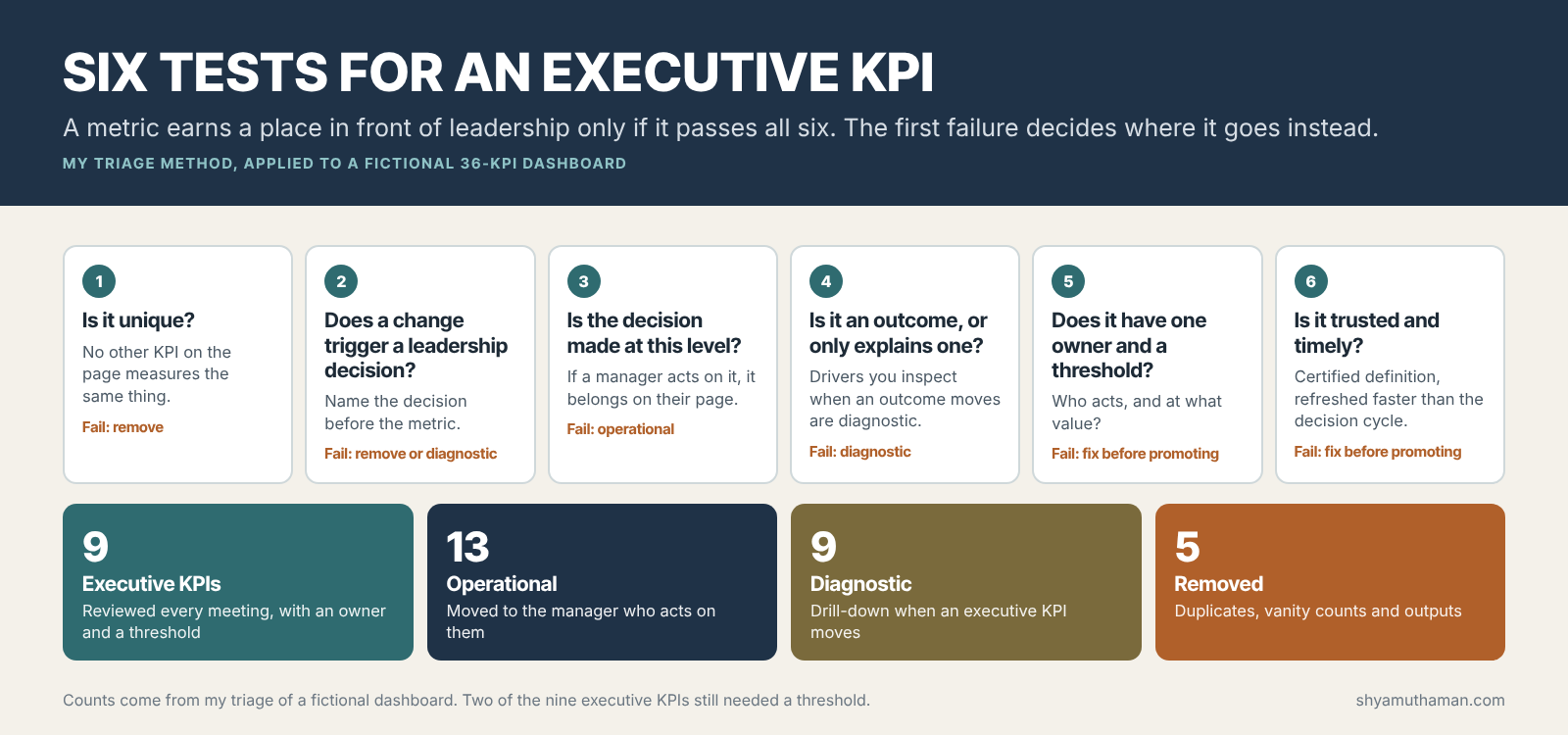
- Is it unique? If another metric on the page tracks the same thing, keep the one that carries a target and remove the other.
- Does a change trigger a leadership decision? Write the decision down first. “If fill rate drops below 95% for two weeks, we approve expedited freight and review supplier allocation.” If you cannot name the decision, the metric is either a diagnostic or noise.
- Is the decision made at this level? Pick rates matter, but a site manager acts on them. Executives should see the result in fill rate, not the driver.
- Is it an outcome, or does it only explain one? Price realization explains margin. Leaders look at it when margin moves. It does not need its own line on the page.
- Does it have one owner and a threshold? One named executive, and a value or band at which the owner must act. Shared ownership means nobody acts.
- Is it trusted and timely? A certified definition, a single source, and a refresh cycle faster than the decision cycle. A monthly metric cannot steer a weekly decision.
I put uniqueness first because it is the cheapest test and removes obvious clutter before the harder conversations. I put trust last because a metric can be the right one to watch and still not be ready. Those go on a “fix before promoting” list rather than being dropped.
The triage result: 36 KPIs sorted
This is the full fictional dashboard and where each metric landed. The classification is my judgment applying the six tests to a fictional company.
| Result | Count | Metrics | Why |
|---|---|---|---|
| Executive KPI | 9 | Revenue vs plan; gross margin %; operating cash flow; order fill rate on time in full; 12-month customer retention; inventory days on hand; revenue from top-20 accounts at risk; safety incident rate; regretted employee attrition | Each triggers a named leadership decision and has one owner |
| Operational | 13 | Pipeline coverage; win rate; quote turnaround; warehouse picks per hour; pick accuracy; truck utilization; invoice exceptions per week; IT ticket backlog; call center answer time; cycle count variance; open positions; AI assistant monthly active users; data pipeline uptime | Managers act on these weekly. Executives see their effect in an executive KPI |
| Diagnostic | 9 | Average order value; price realization; product mix margin; days sales outstanding; forecast accuracy; supplier on-time delivery; backorder lines; NPS; training hours per employee | Used to explain why an executive KPI moved. One click away, not on the page |
| Removed | 5 | Website sessions; social media followers; dashboards published; emails sent by sales; second revenue chart | Duplicates, vanity counts or output counts with no decision attached |
Two of the nine executive KPIs failed test five. “Revenue from top-20 accounts at risk” had no agreed definition of at risk, so sales and finance produced different numbers. Regretted attrition had an owner but no threshold. Both stayed on the page with a deadline to fix them, because the decisions they support are real.
NPS moving to diagnostic will be the controversial call in many companies. My reasoning: in this fictional business, monthly NPS moved within its noise band most months and never triggered a decision on its own. Retention is the outcome leaders act on, and fill rate is the leading indicator that moved first. If your NPS does drive decisions, it passes the test and stays.
What is the difference between leading and lagging KPIs for executives?
A lagging KPI reports a result after it has happened, such as retention or gross margin. A leading KPI moves earlier and can still be influenced, such as fill rate or inventory days. Executives need both, paired: the lagging KPI shows whether the strategy worked, and the leading one shows where to act now.
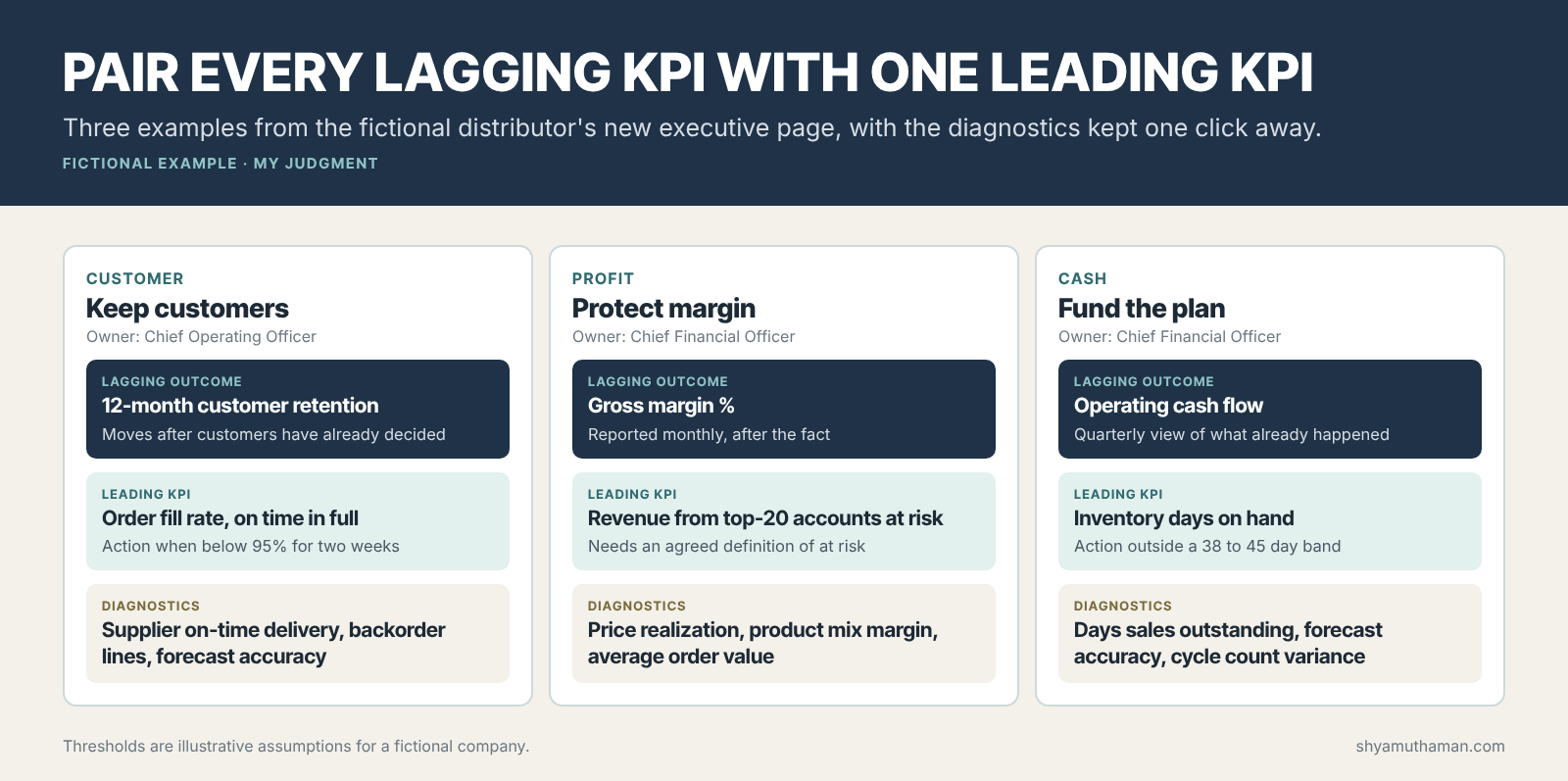
The pairing rule I use is one leading KPI per lagging outcome. More than one and the meeting turns into a diagnostic session. Diagnostics still matter, but they belong in the drill-down that the KPI owner brings when the leading KPI crosses its threshold.
A pair also forces an argument worth having: does the leading indicator actually predict the outcome? In the fictional example, I assumed fill rate leads retention. In a real company that should be checked against history before the pair goes on the page. If the relationship is weak, the leading KPI is only a hope.
Who should own an executive KPI?
One executive who can act on it, chosen before the KPI goes on the page. The owner agrees the threshold, presents the explanation when it moves, and proposes the action. The data team owns the definition and the pipeline, but not the business result. Shared ownership usually means no action.
This is the decision-rights question at the center of data-driven management. A metric without an owner gets discussed every month and acted on never. I cover how to assign these rights, and what happens when the data and the executive’s instinct disagree, in my guide to data-driven decision making. The data team’s side of the same question, how it proves the value of the numbers it supplies, is in data team KPIs.
How do executive KPIs apply to AI investments?
An AI initiative needs an executive KPI it is expected to move, agreed before the money is spent. Without one, the initiative will report usage instead of results, and its return cannot be proven. In the triage above, the AI assistant’s active-user count moved to operational because it explained effort, not outcome.
A common gap in AI business cases: the sponsor promises productivity and later reports logins, prompts and satisfaction scores. None of those is a KPI an executive would act on. The fix is to write down, at approval, which executive KPI the project should move, by how much and by when, and to measure it against a baseline. If no executive KPI is affected, the project may still be worth doing, but it belongs in an operational budget. My AI adoption metrics guide shows how to connect usage to the outcome measure, and the AI prioritization framework shows how missing baselines change which AI projects get funded.
Where this method breaks
- Classification needs judgment. The same metric can be executive in one company and operational in another. Safety incidents are executive in a distributor with warehouses and trucks. They may be operational in a software firm.
- Thresholds can be gamed. Once a number triggers attention, people manage to it. Pairing leading and lagging KPIs, and keeping diagnostics visible to the owner, makes gaming harder but does not prevent it.
- A shorter page is not automatically better. Removing a metric removes a signal. Keep removed metrics available in the operational and diagnostic layers so they can be promoted back if they start predicting outcomes.
How I would run this in a real leadership team
- Print the current executive dashboard and, for each metric, write the last decision it triggered. Blank answers are the first candidates to move.
- Run the six tests in a working session with the metric owners, not in the data team alone.
- Agree a threshold for every surviving KPI before the next meeting, even a rough one.
- Pair each lagging outcome with one leading KPI and check the relationship against history.
- Review the page every six months. A KPI that has not crossed its threshold or triggered a decision in that time is a candidate for the operational layer.
Limits of this example
The 36-metric dashboard, the fictional company, the owners and the thresholds are illustrative examples I created on October 4, 2026. The six tests and the classifications are my judgment. The balanced scorecard reference is to Kaplan and Norton’s published Harvard Business Review article. Nothing here describes a real employer or client dashboard.
Official resources
Harvard Business Review: The Balanced Scorecard, Measures That Drive Performance
MIT CISR: What is data monetization?, on connecting operational measures to financial value.
Choosing which numbers deserve leadership attention, and who has the right to act on them, is the core of The Data-Driven Executive. When the next AI proposal arrives, AI to ROI for Business Leaders shows how to tie it to an executive KPI before it is funded.
How many metrics are on your executive dashboard today, what data do you have about which ones triggered decisions, and what is stopping you from removing the rest?