
DATA LEADERSHIP
Every data leader eventually gets the question from a CFO: what do we get for this team? The easy answer is a list of outputs: dashboards shipped, pipelines built, tickets closed. I built a fictional data organization with five workstreams to show why that answer backfires. The team with the most outputs had no confirmed business result. The team with the fewest cut unplanned downtime on two production lines. And the dollar value a CFO would accept was about a third of what a typical slide would claim.
Short answer: measure a data team on business value it can show, decisions made with its data, how far people trust that data, and what it costs to run. Report direct, influenced, capacity, risk and enabling value separately, and add only confirmed and agreed amounts into a dollar total.
I lead data engineering teams, and the measurement problem never goes away. This article is the scorecard I would put in front of an executive team today. The example organization and every figure in it are illustrative. The method, the categories and the opinions are mine.
What are data team KPIs?
Data team KPIs are the measures leaders use to judge whether a data team is creating business value. Good ones track business results, the decisions that use the team’s data, the trustworthiness of that data and the cost of delivering it. Output counts such as dashboards or tickets belong on the team’s internal dashboard, not the executive one.
Most lists of data team metrics online are long inventories: pipeline uptime, query performance, data freshness, ticket throughput, dashboard views. Each one is useful to someone. Very few would change a CEO’s view of whether the team is worth funding. The test I use is simple. If the metric doubled, would the business be better off? Twice as many dashboards fails. Twice as many decisions made on certified data passes.
Why are dashboards and pipelines bad measures of data team value?
They count work, not results. A team can ship 140 dashboards that few people open, while another ships six pipelines that change how a factory runs. Output counts also reward the wrong behavior: building new assets is visible and counted, while retiring unused ones or fixing definitions is invisible.
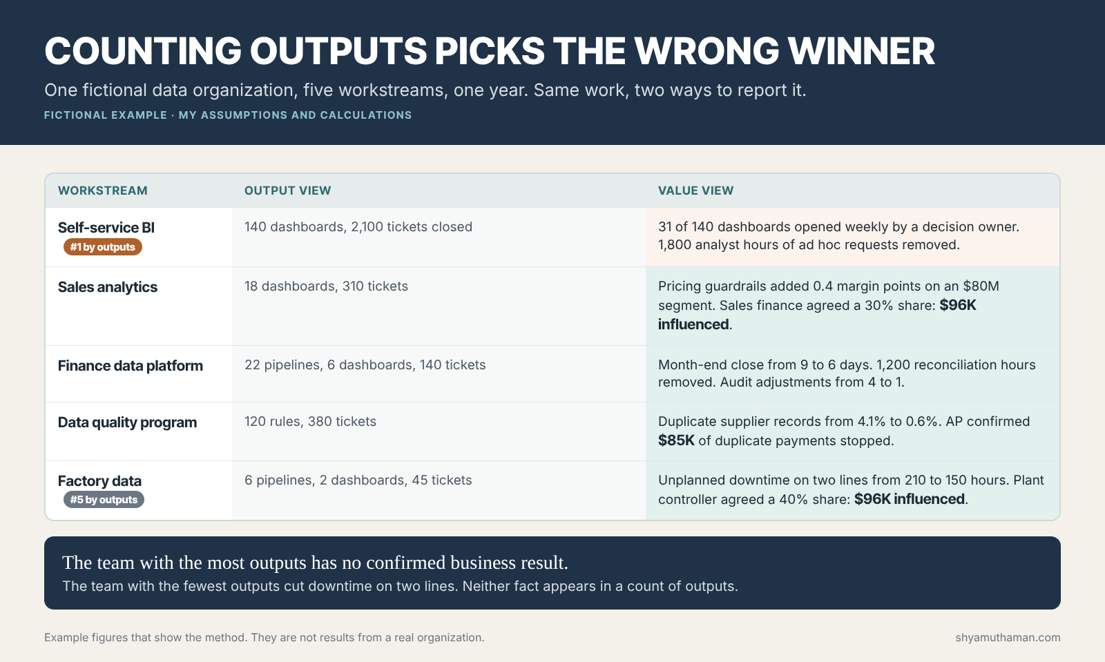
In this fictional example, the self-service BI workstream looks like the star on an output report: 140 dashboards and 2,100 tickets closed in a year. When I added one usage measure, the picture changed. Only 31 of those dashboards were opened weekly by someone who owns a decision. The team did remove about 1,800 hours of ad hoc requests from analysts, which is real, but no business owner has confirmed any business result from it.
Factory data looks like the weakest team on outputs: six pipelines, two dashboards, 45 tickets. Its sensor data feeds the maintenance alerts that, in this example, cut unplanned downtime on two lines from 210 hours to 150 hours a year.
In a budget review, the risk is that the team with the busiest report keeps its headcount while the team doing the work that matters has to defend itself. Output metrics are not wrong. They answer a different question, which is how much capacity the team has and where it goes.
How do you measure the business value of a data team?
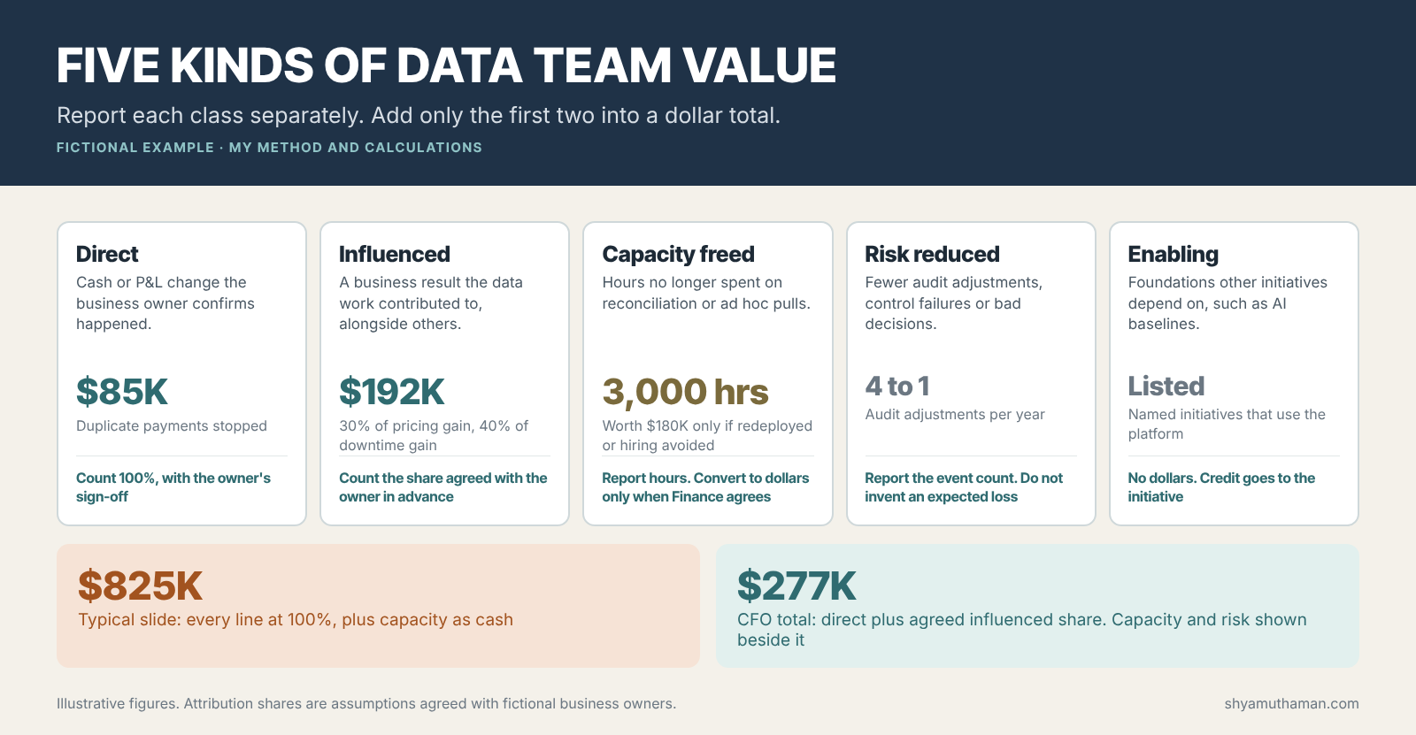
Classify every claimed benefit into one of five types: direct, influenced, capacity freed, risk reduced and enabling. Each type has its own counting rule. Agree the rule with the business owner before the work starts, then report each type separately instead of collapsing them into one inflated number.
Direct value
A cash or profit change that would not have happened without the data work, confirmed by the business owner. In the example, the data quality program cut duplicate supplier records from 4.1% to 0.6%, and accounts payable confirmed $85,000 of duplicate payments stopped. This is the rarest kind of data value and the easiest to defend.
Influenced value
A business result the data work contributed to alongside other people and decisions. Sales analytics built pricing guardrails that, together with a sales policy change, added 0.4 margin points on an $80 million segment, worth $320,000. Claiming all of it would be wrong. Sales finance agreed in advance that 30% would be credited to the data work, so the ledger shows $96,000. The factory downtime reduction is worth $240,000 at an assumed $4,000 of contribution margin per hour. The plant controller agreed a 40% share, so $96,000 again.
The attribution percentage is a negotiated number, and I am comfortable with that. What I am not comfortable with is a share decided after the result is known. Agree it when the project is approved, write it down and keep it.
Capacity freed
Hours of manual work removed: 1,200 hours of month-end reconciliation from the finance data platform and 1,800 hours of ad hoc requests from self-service BI. At $60 an hour that is $180,000, but only if the hours go somewhere measurable. MIT CISR’s research on data monetization frames this well: improvements count once they are turned “into financial value.” Until then I report hours, not dollars.
Risk reduced
Audit adjustments fell from four a year to one after the finance platform replaced spreadsheet reconciliations. I report the count. I do not multiply it by an invented probability and an invented loss to produce an expected-value figure. CFOs see through those numbers, and one inflated line can discredit the whole report.
Enabling value
Some work exists so that other initiatives can succeed. The finance platform now provides the trusted baseline that the company’s AI pilots use to prove their return. That value is real, but the credit belongs to the initiative that uses it. I list the dependent initiatives by name and assign no dollars.
How should a data leader report value to a CFO?
Show a dollar total that includes only direct value and the pre-agreed share of influenced value. Show capacity in hours and risk as event counts beside it. List enabling dependencies by name. In the example, that is $277,000 of defensible value against $825,000 that a typical slide would claim.
The $825,000 figure comes from counting every line at 100% and converting capacity to cash. Nothing in it is fabricated. It is simply what happens when each workstream reports its best case. The $277,000 figure is what survives a finance review.
Here is the uncomfortable part. Assume this fictional 14-person team, including its platform, costs $3 million a year. $277,000 does not come close to covering it. If you try to justify a central data team on attributable dollars alone, you will lose the argument, and you will be tempted to inflate attribution to win it. In my judgment, the right response is to present dollars as one of four layers, never the whole case, the same way Finance and IT justify themselves.
Which KPIs belong on a data team scorecard?
Twelve measures in four layers: business value, decision use, trust and efficiency. Business value shows confirmed results. Decision use shows whether important decisions rely on the team’s data. Trust shows whether people can use the numbers without checking them. Efficiency shows whether the budget goes to assets that are used.
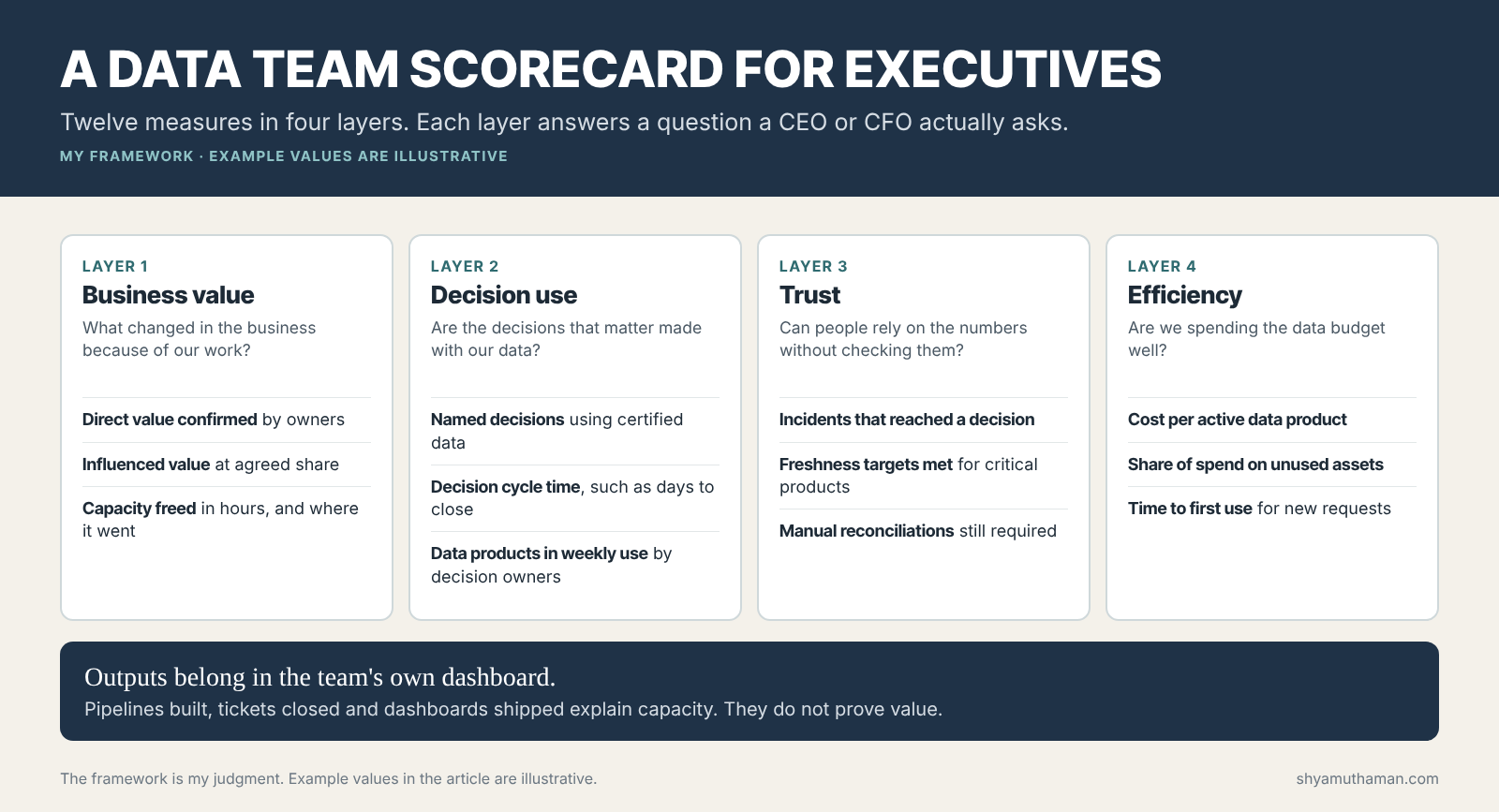
| Layer | KPI | How to measure it | Fictional example |
|---|---|---|---|
| Business value | Direct value confirmed | Owner-signed cash or P&L change | $85K |
| Business value | Influenced value at agreed share | Result × share agreed at approval | $192K |
| Business value | Capacity freed and redeployed | Hours removed, and where they went | 3,000 hours, redeployment not yet confirmed |
| Decision use | Named decisions on certified data | Count of listed recurring decisions that use certified sources | 11 of 18 |
| Decision use | Decision cycle time | Elapsed time for a key decision cycle | Month-end close from 9 to 6 days |
| Decision use | Products in weekly use | Assets opened weekly by a decision owner | 31 of 140 dashboards |
| Trust | Incidents that reached a decision | Data errors found after someone acted on them | 3 this year |
| Trust | Freshness targets met | Share of critical products refreshed on time | 96% |
| Trust | Manual reconciliations remaining | Recurring spreadsheet checks still needed | 7, down from 19 |
| Efficiency | Cost per active data product | Run cost ÷ products in weekly use | Tracked quarterly |
| Efficiency | Spend on unused assets | Share of compute and storage on assets unused for 90 days | Tracked quarterly |
| Efficiency | Time to first use | Days from request to first business use | Tracked per request |
The decision use layer is the one I would start with if a team has nothing today. List the 15 to 20 recurring decisions that matter most to the executive team: pricing changes, inventory buys, hiring plans, credit limits. Then mark which ones use certified data. That list alone usually starts a better conversation than any value estimate, because executives recognize their own decisions on it.
How does data team value connect to AI ROI?
Every AI return calculation depends on a trusted baseline, and the data team usually produces it. If the baseline cycle time or error rate is disputed, the AI project cannot prove its return. That makes baseline readiness one of the most valuable enabling outputs a data team can report.
A familiar pattern in AI business cases: the pilot works, the users like it, and then nobody can agree what the process cost before. My AI prioritization framework discounts any proposal without a measured baseline for exactly this reason. A data team that can say “these six AI initiatives use our certified baselines” is describing value that would otherwise go uncredited. The same logic applies to data readiness for AI and to the semantic layer experiment, where governed metric definitions made the difference between a wrong answer and a right one.
Where does this measurement approach break?
Attribution shares are negotiated, not discovered, and different owners will negotiate differently. Decision counts depend on how you list decisions. Small teams may not have the time to track twelve measures. Use the layers as a structure, and start with the three measures your executives already ask about.
- Attribution can turn political. If business owners refuse to agree any share, report the result and the contribution in words. Do not assign a share yourself.
- Some value never becomes measurable. A finance platform that prevents a bad decision leaves no trace when it works. Event counts and named dependencies are the honest substitute.
- Enabling value can be overclaimed. Listing every initiative that touched the platform is padding. List the ones that could not have run without it.
What I would do in the first 90 days
- List the 15 to 20 recurring decisions the executive team cares about and mark which ones use certified data.
- For every active project, agree the value type and, for influenced value, the attribution share with the business owner, in writing.
- Move output counts to the team’s own dashboard. Keep them; just stop leading with them.
- Start tracking incidents that reached a decision. It is the trust measure executives understand fastest.
- Report the four layers quarterly, with the dollar total limited to direct and agreed influenced value.
If you are building or reshaping the team itself, my guide on how to build a data team covers structure and roles. The behaviors that make people use data in decisions are covered in building a data culture, and the executive side of the same measurement problem is in executive KPIs.
Limits of this example
The data organization, its workstreams, outputs, results, attribution shares, hourly rates and team cost are illustrative assumptions I created on October 4, 2026 to illustrate the method. They are not results from a real employer or client. The five value classes, the counting rules and the scorecard are my framework. The MIT CISR reference is quoted from its public summary.
Official resources
MIT CISR: What is data monetization? describes improving, wrapping and selling as the three ways data creates financial value.
Harvard Business Review: The Balanced Scorecard, Measures That Drive Performance, the original case for reporting more than financial measures.
Proving the value of data work is one of the central themes of The Data-Driven Executive, including decision rights and how to get leaders to act on what the data shows. When the same baselines are used to justify AI spending, AI to ROI for Business Leaders picks up the story.
How is your data team measured today, what data do you have about which decisions use its work, and what is blocking a better scorecard?